My Cart


Wrangletown
- PaperESTATE LABEL® Papers
- DesignAuston Design Group

Wrangletown
- PaperESTATE LABEL® Papers
- DesignAuston Design Group

Wrangletown
- PaperESTATE LABEL® Papers
- DesignAuston Design Group
WRANGLETOWN CIDER COMPANY
Wrangletown Cider Company is a craft cider company in the heart of Humboldt County in Northern California. This small batch hard cider maker is committed to its community, sourcing apples locally and drawing inspiration from the colorful local history for its branding.
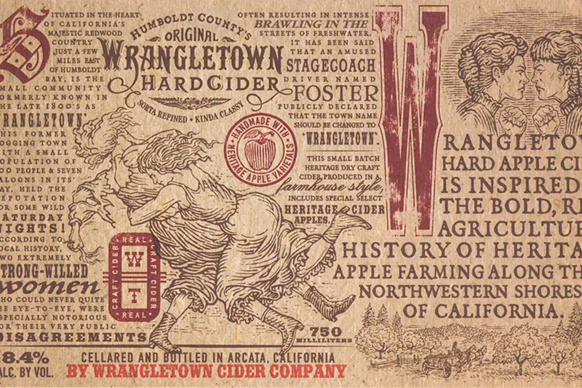
Now a small, quiet community named Freshwater, at the turn of the century this town was known as Wrangletown and was anything but quiet. This mining and logging town once had a population of 30 with seven saloons, making the colorful tales of wild Saturday nights believable.
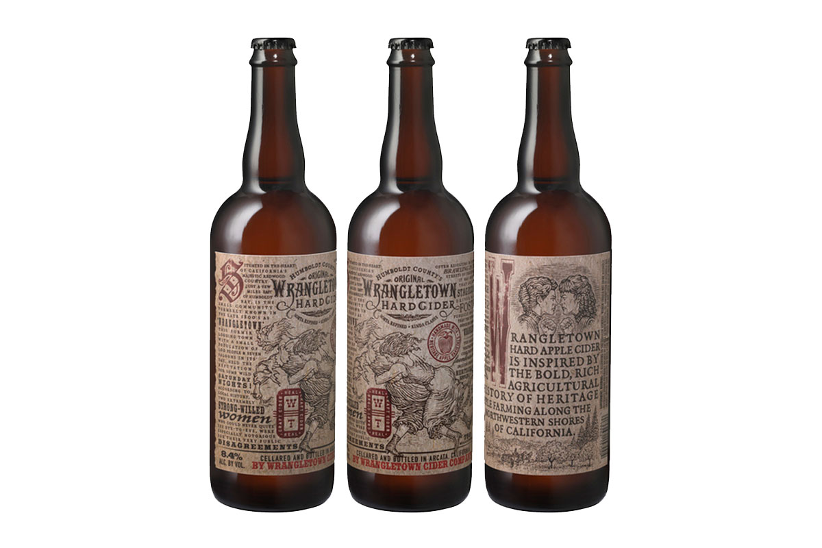
The folks at Wrangletown Cider worked with California-based designer Tony Auston of Auston Design Group to develop the branding and create the label for the line of ciders with this rich history in mind. Auston used a particularly interesting piece of the town’s history for the focal point of the package — the legend of two of Wrangletown’s most disagreeable women. According to local history, these two extremely strong-willed women were especially notorious for their very public disagreements, often brawling in the streets.
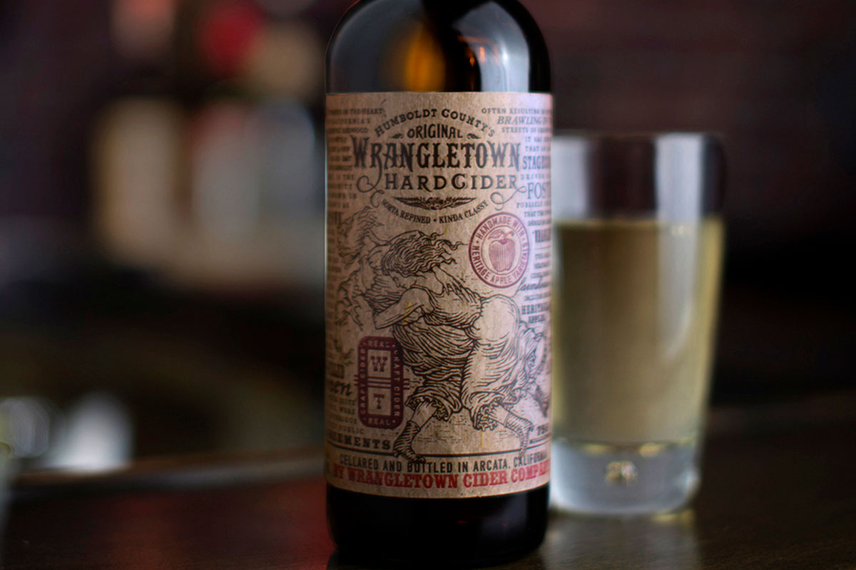
The unique town history not only provided the inspiration for the old-west look, it became a prominent element of the packaging. Auston’s team created every element on the label, from the illustrations to the seals and custom hand lettering, and worked with Portland’s CCL Digital to produce the labels. The uncoated, lightly textured bottle labels are digitally printed on ESTATE LABEL® Papers by Neenah Packaging, the preferred go-to stock for many of the beverage packaging projects that Auston Design Group works on.
To add an extra level of authenticity to the label Auston debossed the brand mark and all of the red elements on the label to simulate vintage letterpress printing, and added a deckle edge die-cut to the left side. ESTATE LABEL® Papers are engineered to specifically meet the challenges of difficult printing techniques making this the perfect choice to help this brand stand out on shelf.
The proprietary, hand-lettered brand mark and the custom woodcut style illustrations were created to roughly reflect the old west look and feel of print design in the late 1800’s. The use of multiple typefaces also evokes the era of the brand’s heritage, and gives the sense that the printer used every piece of wood-type in his drawer — not an uncommon practice back when printers doubled as designers.
“This is an authentically local brand. Wrangletown fully embraces the heritage of craft cider making and has a deep appreciation of the history of its community. It shares both of those messages with every bottle of cider it produces. And, as the motto reads, we think it all adds up to a sort of refined, kind of classy package.”- Tony Auston, Auston Design Group
