My Cart


Chambord
- PaperNEENAH® Folding Board
- DesignBrown-Forman
- PrinterTextile Printing Company
- FinishTextile Printing Company

Chambord
- PaperNEENAH® Folding Board
- DesignBrown-Forman
- PrinterTextile Printing Company
- FinishTextile Printing Company

Chambord
- PaperNEENAH® Folding Board
- DesignBrown-Forman
- PrinterBrown-Forman
- FinishBrown-Forman
CHAMBORD
The award-winning new design for Chambord’s holiday gift box debuted for the 2015 holiday season, and made its second appearance in fall 2016. We talked to Kate Stites, Senior Graphic Designer at Brown-Forman, about the process of designing gift boxes for premium brands and her approach to the Chambord holiday package.
Stites starts with the primary package. The bottles and labels are meant to stand on their own, so her approach to design relies heavily on brand strategy and maintaining the essence and heritage of the brand. This presents a message of consistency in the product for brand loyalists, and an iconic symbol of a premium brand that attracts new customers.
Designing boxes or secondary packaging is a bit different than designing the primary packaging. When it comes to the gift box design, Stites says she shifts to a different design perspective — that of retailers.
"Gift boxes are really important to retailers, they know what works on shelf. It’s important for the package to addresses their needs: A strong presence on shelf, a premium design that appeals to brand lovers, and a design that attracts sales."-Kate Stites, Brown-Forman
In addition to designing to maximize shelf presence, Stites also sees the gift box design as an opportunity to reward consumers for their purchase, to make them feel good about the brand when they get the box home and open it. Stites likes to build in design elements that are revealed during the unboxing process — a message or a bright color. According to Stites, a gift box allows for both a deeper brand experience and premium feel.
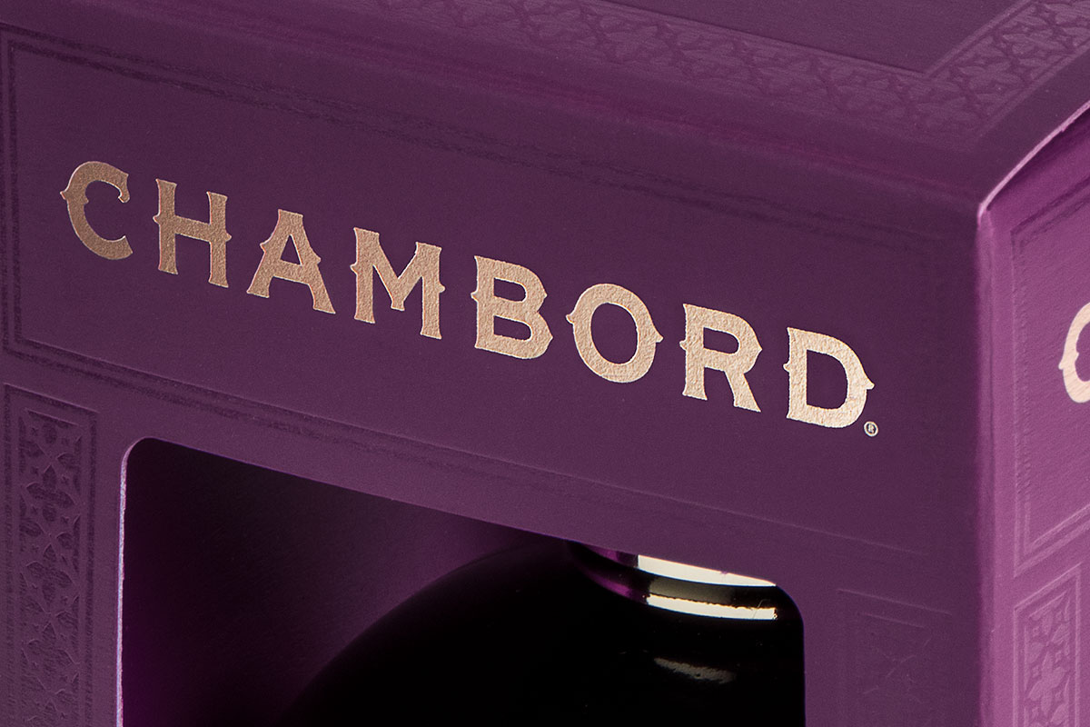
With the Chambord packaging, Stites said they looked to the brand’s flavor cues. Chambord is the only liqueur in the Brown-Forman product line, and it’s very distinct — the bottle, the color, and the flavor. Stites wanted to bring the richness of flavor and luxurious color to the forefront with packaging cues, as well as highlight the beauty of the bottle design.
Stites first changed the packaging material. The previous box was produced on a metallized polyester; she says part of the goal for the new design was to move towards something more sustainable. She says the Brown-Forman team works hard to create keepsakes, rather than disposable items. Her recyclable solution was Neenah® Folding Board, Matte, Duplex, the same board she has now selected for all of the Jack Daniel’s gift boxes. Considering the paper as the base of the design, Stites says, allows her to simplify what she needs to do with the physical elements.
"I liken it to fashion design, if you have this magnificent dress, you don’t want to hide it with a wrap or clutter it up with bangles. It can stand on its own. This paper is perfect for us and lends to a great feel and luxury experience with our products."-Stites
Stites worked with Neenah Packaging to create custom colors — a deep, rich purple for the outside, and a glowing pink inside — which are now exclusive to Brown-Forman. Because there are cut-outs on both the front and back of the box, the light hits the pink inside the box and makes the bottle appear to glow.
Eliminating the standard plastic window coverings was another deliberate design decision which she says served two purposes: An added environmental benefit since removing the plastic makes the package more sustainable, and eliminating the barrier between product and consumer. “Plastic reflects a store’s lighting, making it difficult to see what is inside of a box. By removing the covering we’ve added an extra layer of dimension, and introduced that highly valued touch factor. The added touch of pink draws the eye inward to the bottle itself,” said Stites.
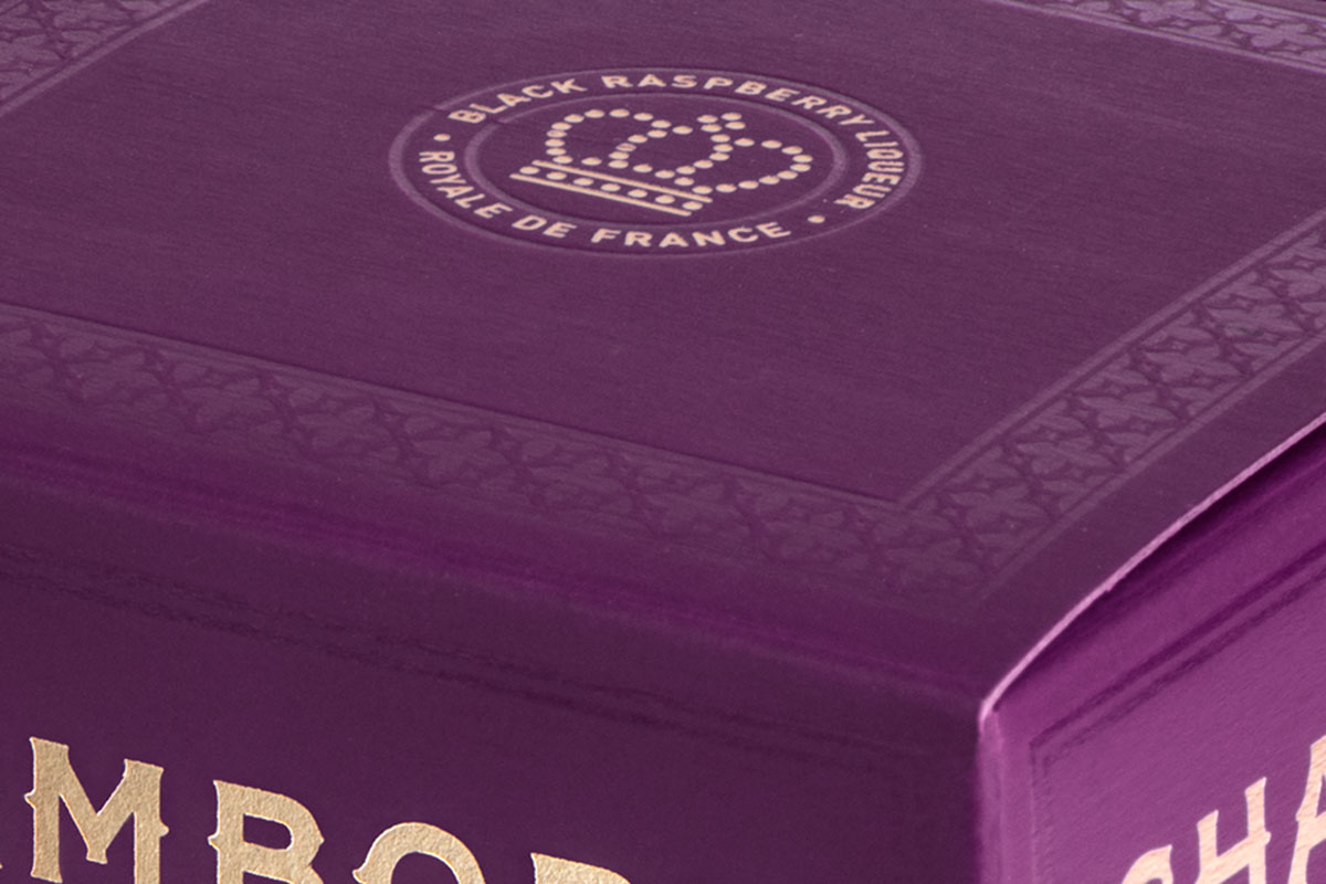
Though the decorative elements are deliberately understated, the production techniques are lush, with debossing, a gloss UV varnish, a silkscreen, and a gold foil stamp. Stites and her team worked with Chattanooga-based Textile Printing Company (TPC) and Neenah Packaging to perfect the production.
"We sent Neenah Pantone® color chips and they made us test sheets so quickly that TPC was able to run early print tests, it was a fantastic and valuable process."- Stites
The structure associated with every alcohol gift box is a challenge, Stites says. The packing engineers at Brown-Forman and Neenah played a significant role in the collaborative effort. Engineering is particularly important when it involves packages that hold heavy, fragile items. Brown-Forman requires a minimum 26pt board to ensure the strength of the box can hold up on shelf. Neenah’s ability to send test sheets quickly allowed for early testing of the structure and ultimately resulted in TPC was able to creating a box Brown-Forman was confident in using for this product. The bottle is solidly held in place with this super-strong box even with front and back cut outs.
"For Brown-Forman brands, we think of the gift box as one more opportunity to honor the brand and reinforce its premium craft heritage. We design the packaging to represent our products, to be well thought out, well-crafted, and premium."-Stites
