My Cart
Behind the Design: Kati Forner Design and the Screen Actors Guild Awards®
Setting the stage for one of the year's most memorable events is no small task, but Kati Forner Design is no stranger to pushing the envelope. A full-service creative studio based in Los Angeles, Kati Forner first partnered with Screen Actors Guild Awards® in 2019 to create an invitation suite for their 25th awards show gala. Since then, her studio has been SAG's go-to to create the perfect invitation that fits the pomp and circumstance of the occasion.
What's it like to design a piece of cinematic history? We sat down with Kati and TJ Tambellini for a behind-the-scenes look at what's involved in creating an invitation suite for such an iconic event.
Neenah: First, how does it feel to know that you're creating something that will be seen by some of the biggest celebrities in the world?
Kati: The first time we worked with the Screen Actors Guild was for their 25th anniversary event. That was definitely intimidating! But it's exciting when you know high-profile people will be interacting with a piece you've created. When we watch the awards, we see people flipping through the designed program. That's really cool. It excites us rather than scares us!
Neenah: What were SAG's must-haves for this year's invitations?
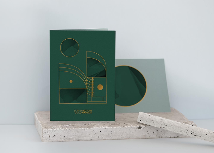
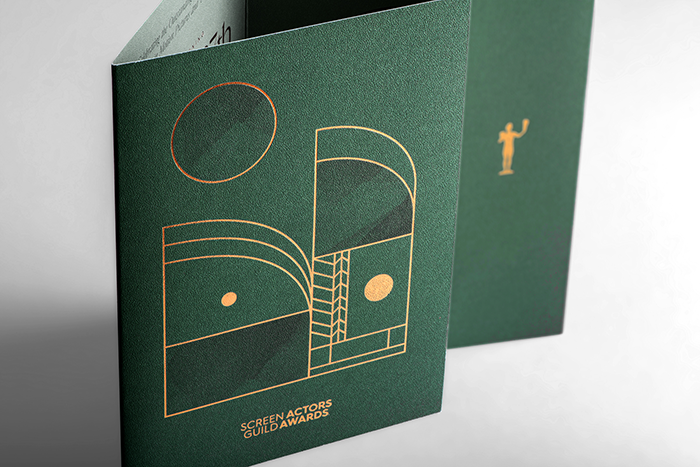
Kati: There are many people involved from the networks down that establish the look and feel before it's our turn. Typically, SAG will come to us with the stage design and graphics they've already started working on. We can't stray too far away from these visuals, or it would feel like a disconnect. This year's theme was art deco, but how we interpreted that was up to us. They did have a specific Pantone green that we had to adhere to. The stage renderings they shared featured a lot of greenery and gold accents. We wanted to incorporate those elements as well.
Neenah: How do you kick off a project like this?
Kati: We just began thinking about unique ways to interpret and elevate the art deco theme to clean, minimalistic. We can't visit the venue for inspiration because it's not staged until the event. We started by sketching and building mood boards. We lucked out with the theme because art deco uses so much gold, and we love using foils. SAG is a big fan of using interesting print techniques to elevate the design, so we knew gold would definitely be in play.
Then we share our vision and boards with the SAG team to make sure we're aligned before we get started. Ultimately, we presented three designs, and, of course, all of them featured a gold accent!
Neenah: Is budget a concern?
Kati: Budget is always a factor, but SAG lets us 'shoot for the stars with our first round. They want to see everything we'd like to do and pull back as needed.
Neenah: How do you present your concepts?
Kati: We walk a team of about four people through each concept, then that team takes it to the committee. It's a massive organization with a lot of design tastes, and many people weigh in.
Neenah: Did they select a design and run with it?
Kati: It was pretty close! We had three different directions. Some were on the nose, following very literal art deco tradition, and some were more subtle. SAG felt like the more literal interpretation paired with the show design and cocktail reception, and other touchpoints that the audience would experience.
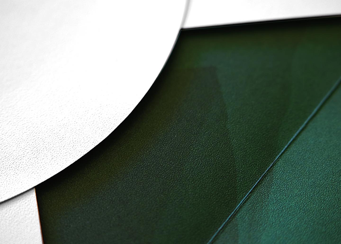
Neenah: We love how the CLASSIC Stipple adds another layer to your design. At what point did you introduce texture into the design?
Kati: We knew from the start we wanted to have an uncoated, textured paper in the mix. That's not just for this project. It's true for 99% of our projects.
We just didn't know what texture would work until we got deeper into the design. There was so much going on graphically. We didn't want the paper to detract from that. They loved the stipple texture we chose. I think they described it as 'feeling like luxury leather.'
Neenah: When looking at current trends in print, we continue to see more uncoated papers used for premium applications. We're seeing designs that incorporate the paper color and texture rather than relying on gloss and foils.
Kati: I can't remember the last time I've chosen a glossy coated stock.
TJ: An uncoated paper just feels so authentic and organic. It goes really well with our aesthetic at KFD.
Neenah: Do you think heightened awareness around sustainability is also driving the uncoated trend?
TJ: Yes, it feels natural. There isn't a client that comes to us that isn't asking for a sustainable solution. As they should!
Neenah: How do you communicate paper choice? Did you create mockups using paper stock?
Kati: There was such a tight timeline we couldn't do a mockup for this project. We used Neenah Swatch Pro for the early stages. It was effortless to show how the texture would interact with the design, even though we presented it on a screen. They could see how the paper and the graphics played together before we could get paper samples for them. It was instrumental in helping them envision the final piece.
Neenah: How long did the entire process take?
Kati: From start to finish, a couple of months. We've got a history of working together. We know their process, so we plan our timeline accordingly. We had only one round of revisions this year!
Check out the stunning SAG invitation and other unique designs on the Idea Shop, Neenah's newest website for printspiration.


