My Cart
Make 2020 A Classic Year
The top three New Year’s resolutions rarely change from year to year; eat healthier, exercise more, and start saving. Sadly, only 46% of people who make these resolutions are actually successful at achieving them. In 2020, break out of the boring same old, same old resolutions and find a way to add some spice into your design work instead. We’ll even provide the inspiration.
With our beautifully printed 2020 calendar, you can add a new year’s resolution you can totally achieve: Incorporate more color and texture into your design! We’ve put together surprising color and texture combinations for each month, intended to leave you feeling inspired by paper and techniques. No more excuses to elevate your print and wow your clients!
Nothing is more Classic than a Calendar
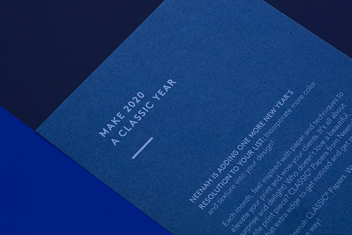
Before Pantone announced their Classic Blue as the Color of the Year, we chose Chambray in CLASSIC CREST® Papers as the signature sheet to greet you immediately upon opening the calendar. Great minds, right? A color that’s a refined take on traditional denim to the palette, this soft, serene blue is subtle by nature but is a perfect complement to foils, metallic inks, or simple blacks.
CLASSIC CREST Cover in Chambray printed Digitally on the HP Indigo® 7900 using 2 clicks of Opaque White.
Each month of the year brings a new CLASSIC® Paper color and texture, printing technique, and pro-tip, allowing you to have that extra edge to get noticed and get results. Simple, but useful in design, consider this twelve-month calendar your guide to transforming your relationship with paper and print in 2020 and beyond. We’ve picked a few of our favorites to feature here.
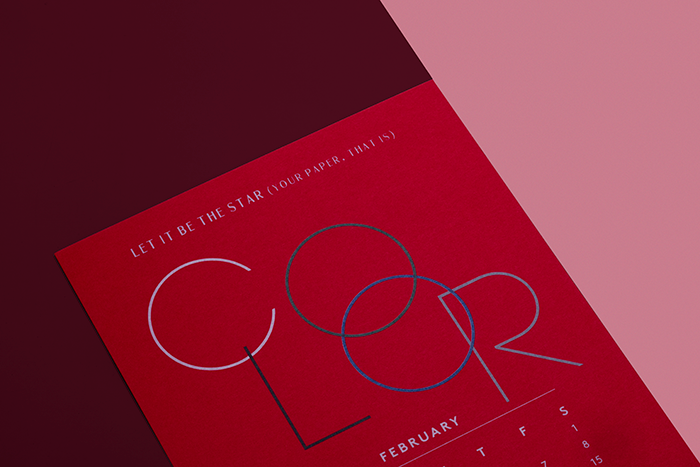
February: Let Paper Be the Star of the Show
Think of paper as an element of your design and colored paper as your secret weapon to stand out from the ordinary. Color is proven to increase brand recognition and create long-lasting connections. The perfect shade of natural white can warm up a photo while a bright, eye-catching red becomes the star of the show. Color can help turn a simple mindset into a sublime masterpiece.
The intense, robust reds found throughout China, symbolic of fire, happiness, and good fortune, are the inspiration behind our Imperial Red. A force to be reckoned with, this energetic red makes for memorable messages. Imperial Red is a color sure to steal the show and your heart this February.
Here, CLASSIC CREST Cover in Imperial Red is a show-stopper. Printed digitally using 3 clicks Opaque White overprinted with 4C process using the HP Indigo® 7900
May: Head-Turning Elegance
Pearlized papers shine when it comes to elevating your design. Let the substrate itself become the premier element, turning heads the whole way. May is synonymous with spring, and with it comes new milestones worth celebrating in elegant style. Nothing adds more glitz to a graduation or wedding invitation than the shimmering surface of a pearlized finish enveloped in a subtle, sleek linen finish.
Because process inks are transparent, the pearl surface shines through giving a metallic look to your inks, causing images to appear more vivid and noticeable. From business cards to wedding invitation, pearlized papers can turn a simple design into something spectacular.
We chose CLASSIC® Linen in White Pearl paired with soft PANTONE® Warm Gray 5, creating an elegant look that instantly commands attention.
July: Texture to Engage
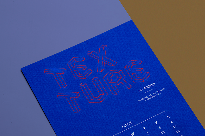
Paper invites interaction, and texture ensures lasting engagement. With textured papers, you don’t have to overdo your design- keep it simple and let the paper do the talking. The word online is crowded with ads and emails; use textured paper to capture and hold audience attention beyond the screen.
Tasked with creating eye-catching and impactful traditional and digital marketing campaigns, marketers look for solutions that work together. Leverage the unique, three-dimensional benefits of textured paper to complement your digital design for the best results. By using a texture such as CLASSIC® Techweave, you can have the best of both worlds, the feel of finely woven fabric with a high-tech twist.
CLASSIC Techweave in Cobalt creates a tactile sensation only found offline. Paired with PANTONE® 032 Engraving and PANTONE® 877 for a stunning, high-tech appeal.
December: The Magic of Surprise
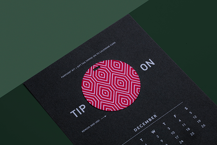
Embellishments are the perfect way to call out a special message or add interest and effect to an otherwise ordinary promotion. In our case, we added a bonus gift to December using a temporary “fugitive” glue that allows for the removal of the tip-on without any residue or damage. Consider a tip-on using a distinctive texture, separate from the base piece, and a design that is visually stimulating to catch the recipient’s eye and entice interaction.
Permanent tip-ons add interest and dimension by gluing the extra element flush to the original piece. You can use a different paper stock, with different print or finishing techniques for a more dramatic effect.

For a surprising and appealing holiday feel, we selected CLASSIC® Stipple in warm, Military Green and gift card tip-on in CLASSIC Linen Red Pepper for an unexpected, attractive holiday feel.
With endless combinations of color, texture, paper and print techniques, the sky’s the limit to taking your ideas wherever they may lead in 2020!
Love these ideas and want more request the calendar here. Available while supplies last.


